Mēlie
Mēlie is a Guyanese-inspired tea brand rooted in South American heritage — centering tea and Guyanese pastries as everyday expressions of care. As founder and creative director, I built the brand from the ground up: identity, packaging, voice, and vision. Mēlie is early in development, but the foundation is strong — thoughtful design, rooted culture, and a clear sense of purpose.
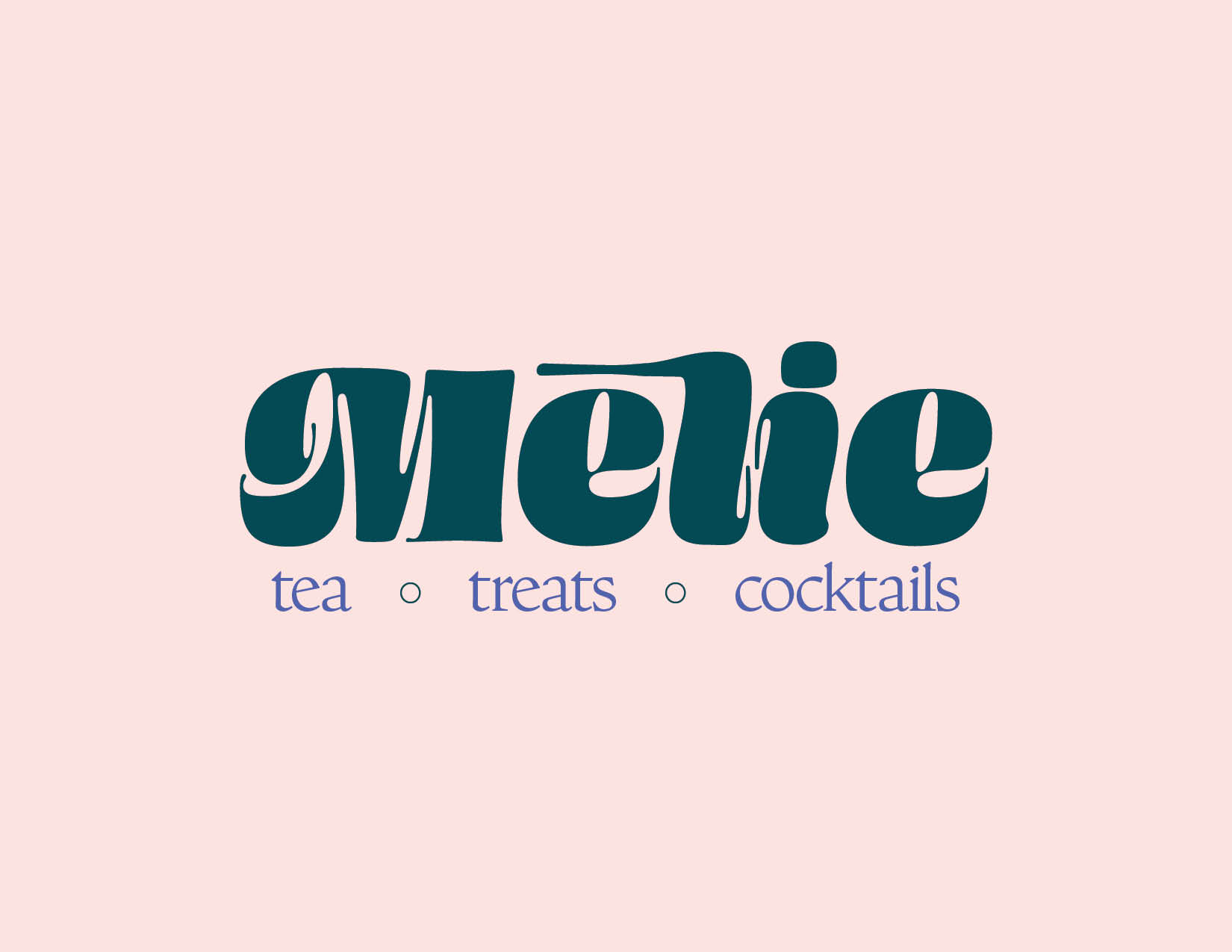
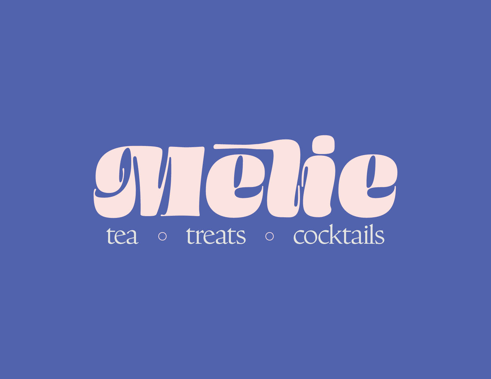
The essence of the past meets the ease of the present. Mēlie's logo draws inspiration from the vibrant forms of the '70s and '80s, reimagined with a modern softness. The custom letterforms are bold yet fluid — rooted in nostalgia, but shaped for now. A mark that feels both familiar and fresh, grounded in heritage and designed for what's to come.
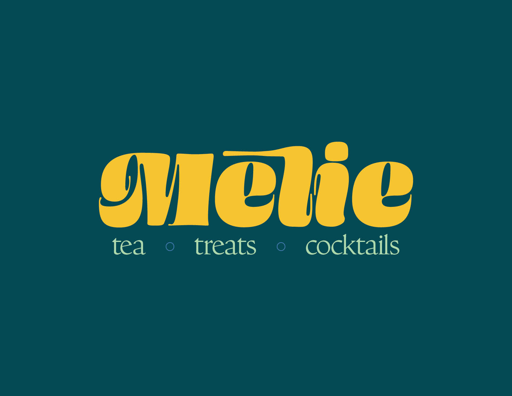
Mēlie's color palette is drawn from the richness of the Amazon — lush, grounded, and full of quiet wonder. Each hue was chosen to evoke warmth, softness, and a connection to the natural world. From earth tones to sunlit pastels, the palette reflects both the brand's cultural roots and its sense of ease. Color as memory, mood, and meaning — an invitation to feel before you even sip.
Mēlie's visual identity blends warmth, elegance, and a sense of familiarity. Omnes carries the friendly curves and subtle retro flair that felt right for a brand born from family and tradition. Nicholas brings refined contrast for body copy — grounded, timeless, and legible, while still expressive in form. Together they give Mēlie a distinct voice: inviting, grounded, and culturally resonant.
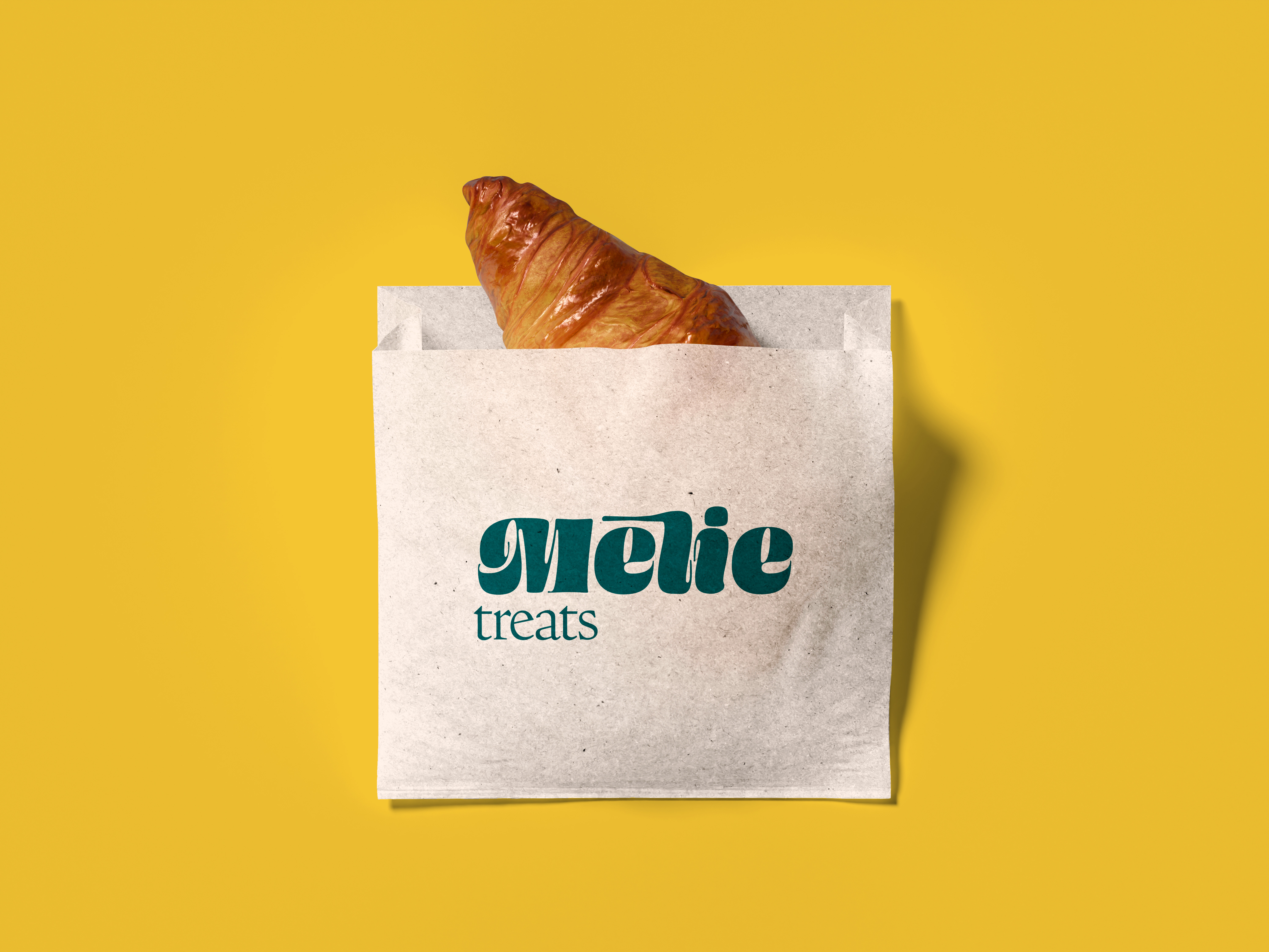
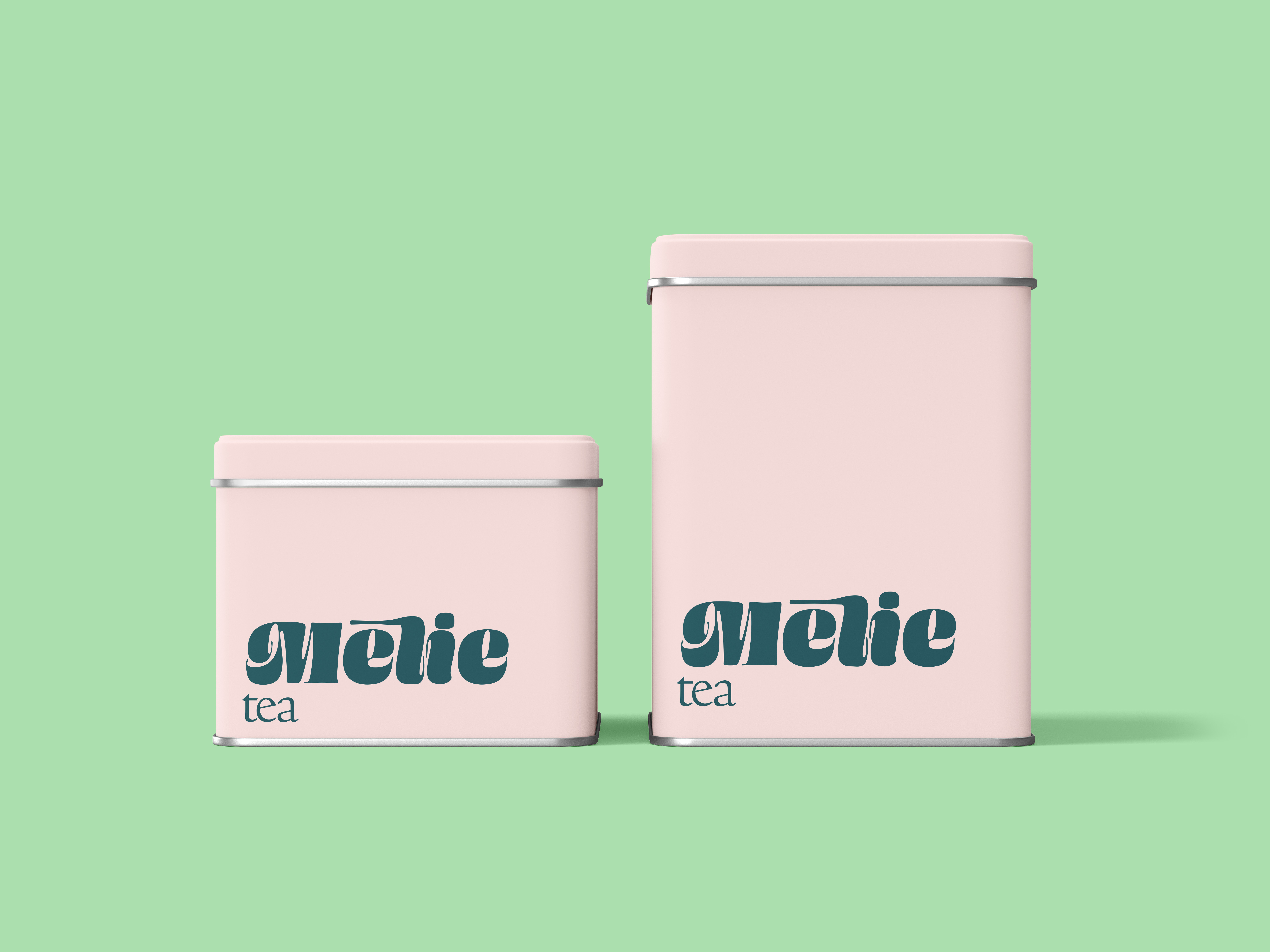
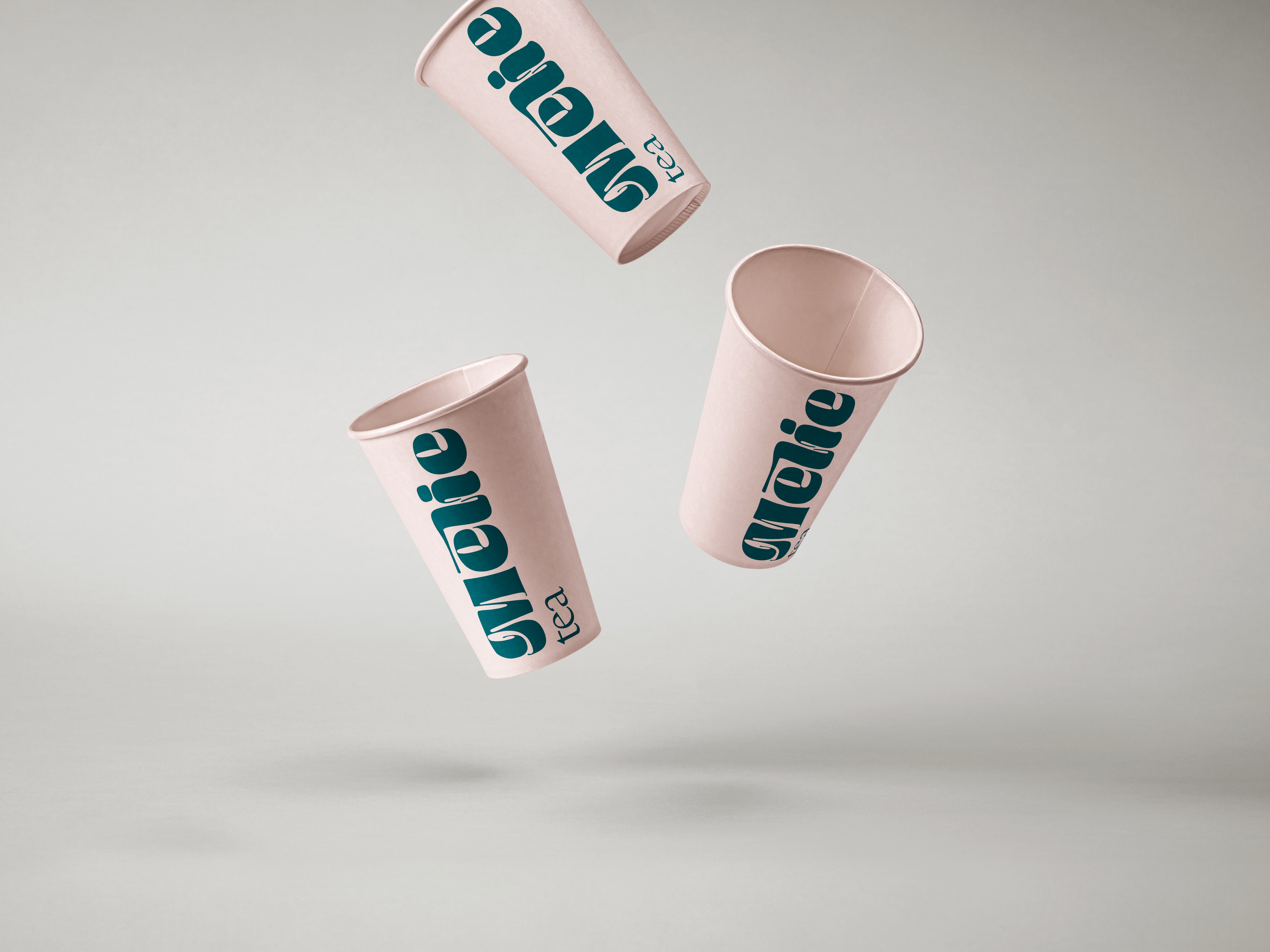
The packaging extends Mēlie's story into the everyday. From paper cups to tins and treat bags, every element is designed to feel tactile and thoughtful — modern but not sterile, clean but not cold. The layout lets the logo breathe while typography creates gentle movement across the surface. Color across packaging is both functional and expressive, helping each product line feel distinct yet part of a larger rhythm. Packaging you want to hold on to — quietly bold, intentionally soft, made to feel like home.